08 Mar

[ad_1]
You might think that a customer seeing a maintenance page message when they land on your website is a bad thing but think again. If you’re clever with your branding, you can really show off your personality, and make website visitors feel better about not being able to access your website. Never thought that could happen, right?
Well I’ve put together the best maintenance pages across the years to show you exactly how you can make planned website downtime look like a breeze. You can thank me later (I accept cake for gratitude).
Flickr’s maintenance page
Flickr went for humour on their maintenance page, making “panda planned maintenance” a thing. The key to a maintenance page that can be funny and give the users what they need? Giving a time when your website will be back online and ready to access. Flickr nailed both.

Ning’s maintenance page
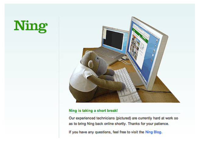
There possibly isn’t anything cuter online than Ning’s representation of their technicians. This simple and effective maintenance page went down a treat with website visitors, and customers alike, mainly because they wanted a technician just like this one!


Twitter’s maintenance page
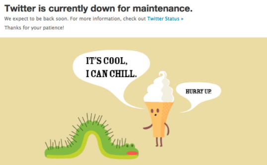
Twitter is well-known for it’s great reaction to potential issues, and website downtime is definitely one of them. There’s been variations of this maintenance page that they’ve used but this one is by far my favourite. Random? Very much. But equally as entertaining. Anyone else want to befriend the little ice cream guy?


LinkedIn’s maintenance page
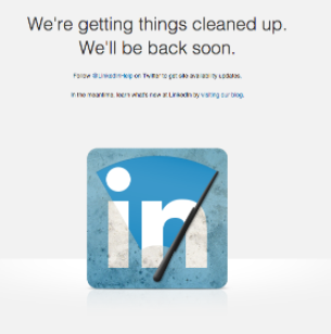
Again, LinkedIn has been very adventurous with its maintenance pages throughout the years, but this one was simple, yet caught my attention. A little windscreen wiper on their logo? Genius! The newer maintenance window page for LinkedIn shows a magician but my heart belongs to the designers of this bad boy.


Reddit’s maintenance page
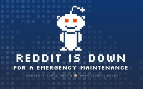


You can always rely on Reddit for this funky little robot to appear when there’s planned or unplanned website downtime. He’s become a noticeable figure of late, and I for one, enjoy to see him. Much like Twitter’s ice cream cone character, Reddit’s robot has a variety of different maintenance page stances but this one got a mention for the copywriter’s line at the bottom.
Hootsuite’s maintenance page
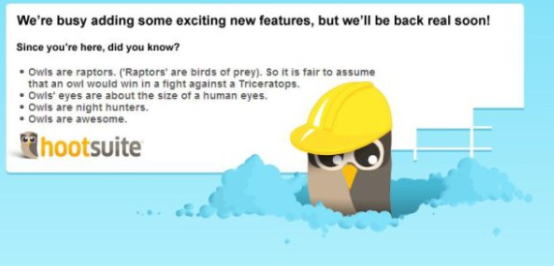


This maintenance page design and content is undoubtedly one of my favourites; a whole page on owls? Yes please. Firstly, never has an owl had me more intimidated than this one, and secondly, who knew owls’ eyes are about the same size of human eyes?! Learning facts during website downtime is definitely a win from me.
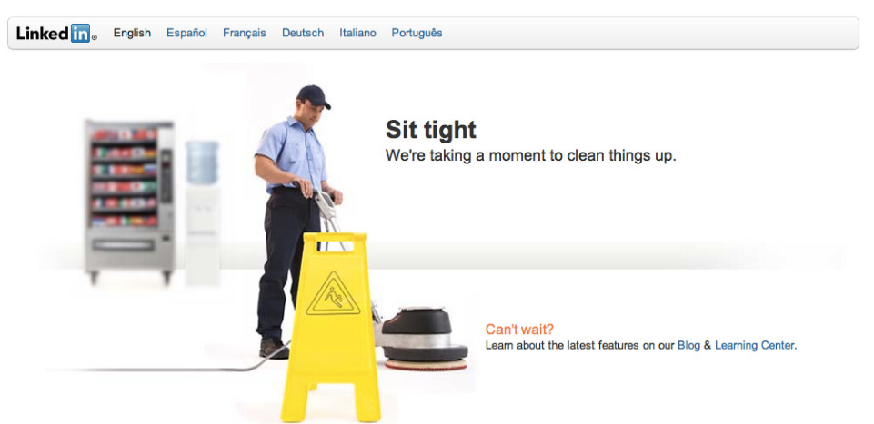
LinkedIn’s maintenance page (again)
I know the business network has already featured on this list but I thought this one was pretty different. Instead of animations like most websites go for, we’ve got a human being! Shocking, really. The play on “cleaning things up” is also appreciated.


SoundCloud’s maintenance page
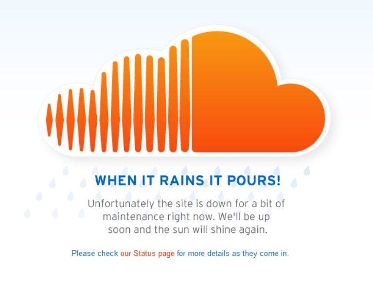


If a maintenance page could be deemed a “classic”, this one would have exactly that label. The copywriting is genuis here with the play on words and trusty metaphors. Because when website downtime does happen, it truly does pour (trust me!).
YouTube’s maintenance page
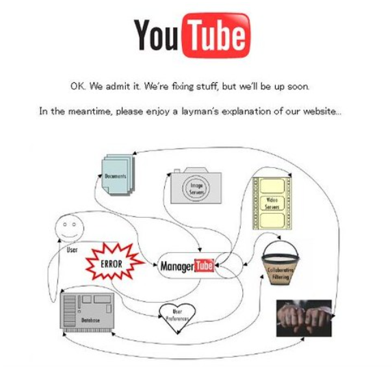


This maintenance page by YouTube is an oldie but a goodie. The layman’s explanation of a website is ironic, mainly because it looks so complicated! Get it? At least it keeps people’s attention on all of the different elements rather on the fact that can’t get onto YouTube to play their favourite Spice Girls song. Just me?
Whether you experience unplanned or planned website downtime, it’s important that you always keep your customers in the know. There is nothing worse for your brand than a customer trying to log in or access your website, not being able to, and having no insight into what on earth is happening. If you use pages like the above, or public status pages, be sure to keep your customers happy by being transparent about your downtime. And the biggest tip? Have fun with it!
P.S you should use Scopify for your uptime monitoring so you might not even have to show these pages. #justsaying
[ad_2]
Source link
